Elements
Reference
Text
This is bold and this is strong. This is italic and this is emphasized.
This is superscript text and this is subscript text.
This is underlined and this is code: for (;;) { ... }.
Finally, this is a link.
Heading Level 2
Heading Level 3
Heading Level 4
Heading Level 5
Heading Level 6
Heading Level 2
Describes major sections of the page.
Heading Level 3
Subsections of the main content.
Heading Level 4
Details or categories under a subsection.
Lists
Unordered
- Flexible layout styles.
- Easy navigation for content.
- Provides grouping of information.
Icons
- Social media links.
- Functional navigation shortcuts.
Actions
Blockquote
"Highlighting key phrases or quotes for emphasis."
Image
Fit
This refers to the technique of resizing and aligning images within a container or layout without distorting their proportions. It ensures the image looks natural and visually appealing across different devices and screen sizes.


Left & Right
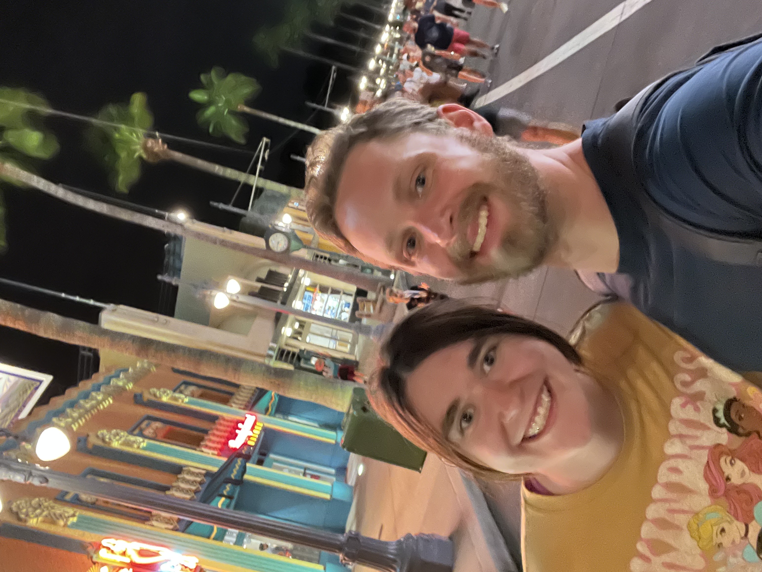
 When images are aligned to the left, the accompanying text flows naturally around the image, creating a seamless integration of visuals and content. This layout is particularly effective for showcasing important visuals while maintaining a strong connection to descriptive text. For example, a left-aligned image could highlight a product, while the text to the right provides detailed information about its features and benefits. The visual hierarchy draws attention to both the image and the content without overwhelming the reader.
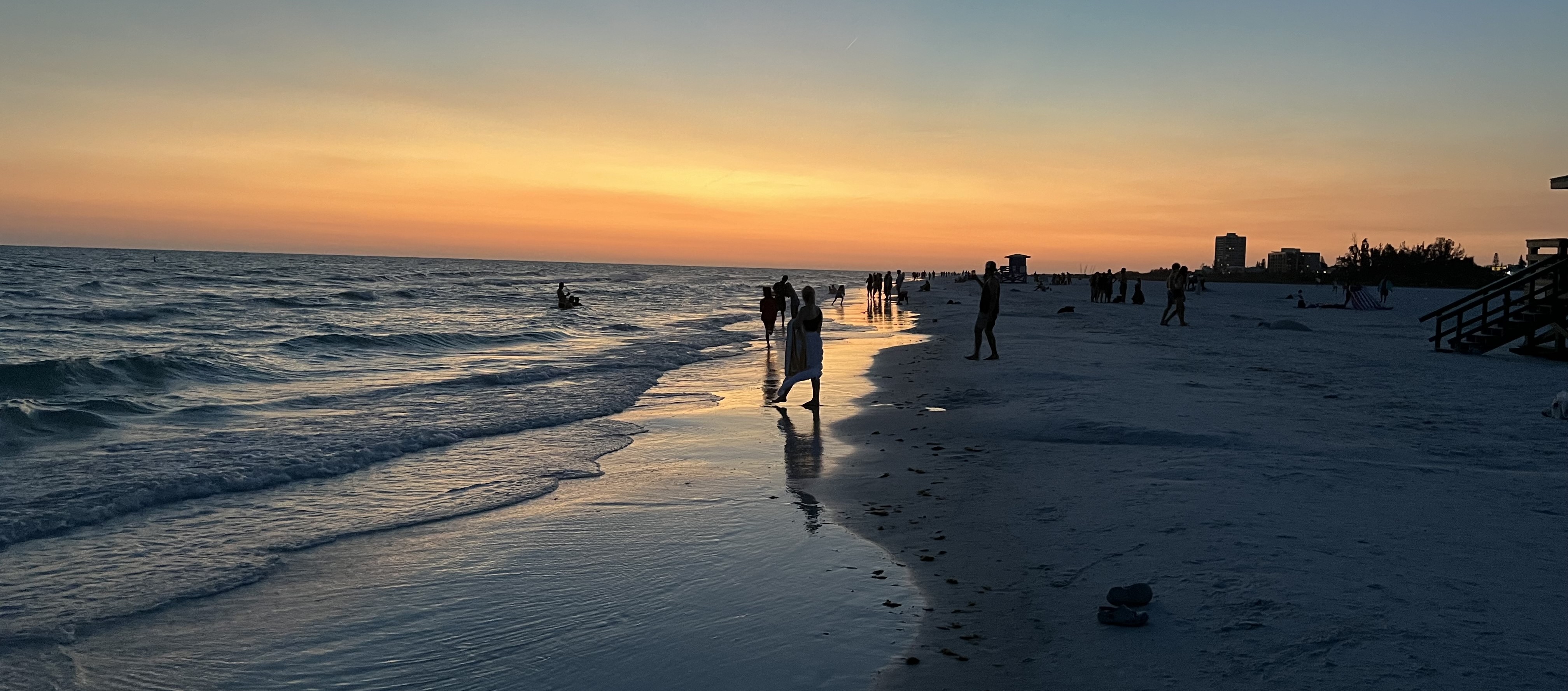
 Similarly, right-aligned images allow the text to flow to the left of the visual, offering a balanced layout that emphasizes the content while still showcasing the image. This approach is useful for creating contrast or guiding the reader’s eye through the page. For instance, a right-aligned image could depict a workflow or a process, while the accompanying text explains the steps in detail. This combination ensures that both the text and the image are equally engaging and informative.
Table
Default
| Name | Description | Price |
|---|---|---|
| Berserk | Guts’ dark and violent journey through a medieval world. | 29.99 |
| Jujutsu Kaisen | A tale of curses, sorcery, and epic battles. | 19.99 |
| My Hero Academia | A young boy strives to become a hero in a superpowered society. | 29.99 |
| Dragon Ball Z | Goku faces powerful foes in his quest to protect Earth. | 19.99 |
| Attack on Titan | Humanity battles titans in a post-apocalyptic world. | 29.99 |
| 130.00 | ||
Buttons
Form
Box
Boxes are a versatile design element used to highlight or separate content on a webpage. They provide structure and help in organizing information effectively. For example, a box can be used to group related content, such as a feature list, a call-to-action, or even a notification. A box element typically includes padding to create space between the content and the border, making the content more readable and visually appealing. You can also style boxes with background colors, shadows, or borders to make them stand out from the rest of the page. Well-designed boxes improve the user experience by breaking up large chunks of text and adding a sense of hierarchy to your content. This ensures that users can easily find and focus on the most relevant information. Whether you need subtle accents or bold statements, boxes can adapt to suit your needs.
Preformatted
// Parallel Count Sort Function
#pragma omp parallel for num_threads(numThreads) shared(array, count, n) private(local_count)
for(int i=0; i < n; i++) {
		local_count = 0;
		for (int j=0; j < n; j++) {
			if (array[j] < array[i]) {
					local_count++;
			} else if (array[j] == array[i] && j < i) {
					local_count++;
			}
		}
count[i] = local_count;
}
#pragma omp parallel for num_threads(numThreads) default(none) shared(array, temp, count, n)
for (int i = 0; i < n; i++) {
		temp[count[i]] = array[i];
}

array = temp;